
For years, home decor trends have been dominated by cool grays, stark whites, and unyielding beiges. Touted as clean, modern, and minimalist, these monochromatic palettes took over residential developments across Northern Colorado and the rest of the country. However, as these clinical color schemes settled into our daily lives, environmental psychologists began noticing a troubling trend. Far from creating a sense of calm, entirely stark, colorless environments can actually contribute to feelings of sadness, isolation, and heightened anxiety.
The belief that neutral colors are inherently soothing is a common design myth. In reality, an environment devoid of color variation can lead to psychological under-stimulation. When the human eye enters a space where the walls, ceiling, trim, and floors blend into a single, uniform shade of white or gray, the brain lacks the visual anchors it needs to feel grounded. Research highlights that color choice is one of the three most powerful interior design elements affecting mental health, as noted in a study by Medicinal Media. The study explains that our minds use natural colors to signal a thriving, safe environment.
What Color Calms Anxiety and Reduces Stress in a Home?
Muted, nature-based shades of green and soft, low-saturation blues are the most effective colors to calm anxiety and reduce stress in a home. Environmental psychology shows that these colors lower heart rates and reduce physiological arousal by mimicking organic landscapes. To optimize a home for mental wellness, designers recommend grounding spaces with warm, earthy neutrals such as terracotta, soft taupe, and clay rather than clinical, stark whites or cool grays.
The Hidden Biology of Monochromatic Stress
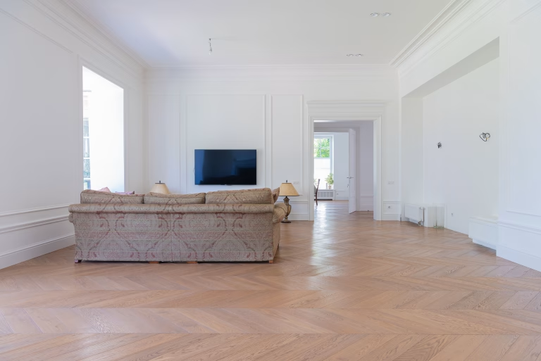
When you live inside a completely white or gray room, your brain suffers from what psychologists call sensory under-stimulation. Human eyes evolved to interpret a massive spectrum of colors in the natural world. In nature, a landscape completely devoid of color variety usually indicates a harsh, dead, or threatening environment, such as a frozen wasteland or a severe drought.
When we replicate this colorlessness inside our homes, our subconscious mind flags the space as sterile and unnatural. This environmental misalignment can trigger a subtle, low-grade survival response. Instead of feeling relaxed when you walk through your front door after a long day at work, your nervous system remains on alert, searching for visual data that simply is not there.
Furthermore, a study exploring the relationship between color and spatial perception published by Marymount University notes that interior architecture and color palettes dictate how safe or vulnerable a person feels in their home. Stark white finishes reflect harsh artificial light rather than absorbing it. This creates a high-glare environment that strains the eyes and causes physical fatigue, which rapidly morphs into mental irritability.
The Emotional Spectrum of Your Paint Choices
To break away from toxic neutrality, it is important to understand how different paint pigments interact with your emotional state. Every hue carries a specific psychological profile:
- The Institutional Gray and Stark White
Cool grays and brilliant, untinted whites are highly reflective and carry strong cultural associations with hospitals, corporate offices, and clinical settings. When applied universally across a home, they strip away the feeling of domestic security and replace it with a subtle sense of professional pressure or medical vulnerability.
- The Nature-Inspired Green
Green sits at the center of the color spectrum and requires zero adaptation from the human eye, making it incredibly restful. Muted sage, olive, and moss greens signal the presence of water, life, and growth. Incorporating these tones into high-stress areas like home offices or living rooms can lower blood pressure and foster deep emotional recovery.
- The Biological Blue
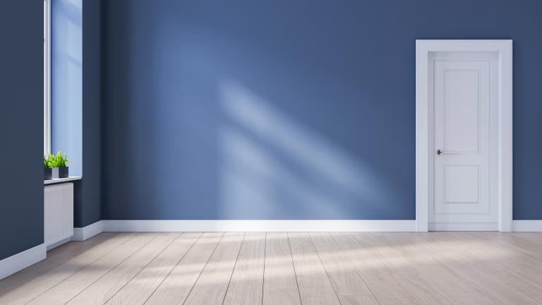
Low-saturation blues are universally recognized for their ability to bring a sense of tranquility. Soft sky blues, dusty denim, and deep slate tones actively trigger the parasympathetic nervous system, slowing your pulse and preparing the mind for rest. This makes them highly effective choices for bedrooms and bathrooms.
Paint Palette Style | Psychological Impact | Best Residential Application |
Clinical Monochromatic | Sensory under-stimulation, isolation, high eye strain | High-traffic transition spaces onlyh (hallways, mudrooms) |
Organic Biophilic | Restorative, lower pulse, reduced cognitive fatigue | Living room, home offices, creative studios |
Warm Earthy Tones | Grounding, cozy security, visual stability | Bedrooms, dining rooms, conversation nooks |
Navigating the Colorado Landscape Indoors
Here in Northern Colorado, the visual disconnect between our vibrant environment and sterile interior design is uniquely apparent. Local homeowners look out their windows and see the warm, rich earth tones of the foothills, the deep greens of the pines, and the golden hues of the plains. Stepping back inside a home painted in cold, icy grays creates an immediate psychological clash.
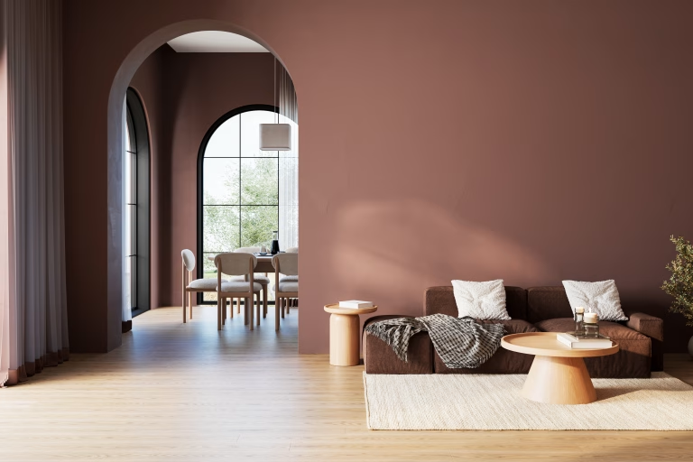
To bridge this gap, modern color strategy is moving toward organic warmth. Home wellness strategies highlight how incorporating regional tones such as sun-baked clay, deep ochre, soft taupe, and muted sand can completely alter a home’s atmosphere. By replacing cold pigments with warm alternatives, you give your brain the visual anchors it needs to feel truly grounded in its geographic location.

How to Safely Reintroduce Color to Alleviate Stress
If your home is currently trapped in a cycle of clinical neutrality, you do not need to panic-buy bold, bright paints. In fact, over-correcting with highly saturated, bright accent walls can cause sensory overload, which elevates anxiety just as much as a sterile white room. Instead, follow a deliberate, step-by-step approach to restore emotional balance:
- Ditch the Accent Wall: Rather than painting a single wall a shocking color, use a technique called color drenching. Choose a soft, low-saturation earth tone or a muted green, and paint all four walls, the baseboards, and the trim in that same hue. This wraps the room in a single, cohesive shade, creating a comforting cocoon effect that instantly reduces anxiety.
- Select a Flat or Matte Finish: High-gloss and semi-gloss paints bounce light aggressively around a room, contributing to visual noise. Opt for flat, matte, or velvet finishes. These textures absorb light gently, softening the edges of the room and creating a soothing visual experience.
- Layer with Warm Elements: If you cannot repaint your walls immediately, counteract the coldness of white or gray surfaces by introducing rich textiles. Layer your space with organic linen curtains, woven wool rugs, and solid wood furniture pieces that introduce natural color variation without touching a paintbrush.
Your home should act as a psychological shield against the chaos of the outside world. By intentional design choices and grounding your walls in colors that respect your biology, you can transform your house from an anxious space into a true mental sanctuary.