For years, bright whites and cool grays dominated interior design. They felt clean, modern, and safe. But as we head into 2026, homeowners are craving something different. Something warmer. Something with depth, emotion, and personality.
Enter the new era of moody colors and warm tones.
At Eheart Interior Solutions, we’re seeing a clear shift in what clients want for their homes. People are moving away from sterile spaces and toward interiors that feel grounded, comfortable, and expressive. The 2026 color palette reflects that change, blending rich, saturated hues with earthy warmth to create spaces that feel timeless rather than trendy.
If you’re planning a remodel, refresh, or full interior redesign, here’s what you need to know about the colors shaping homes in 2026 and how to use them beautifully.
Why Moody and Warm Colors Are Taking Over
Design trends don’t happen in a vacuum. They reflect how people want to feel in their spaces.
After years of fast-paced living, digital overload, and open-concept minimalism, homeowners are craving homes that feel like a refuge. Warm, moody colors provide exactly that.
These tones:
- Create a sense of comfort and intimacy
- Add visual depth and architectural interest
- Make spaces feel intentional and curated
- Age better than stark whites and cool grays
Instead of feeling dark or heavy, today’s moody palettes feel rich, layered, and inviting when used correctly.
- Deep Earth Neutrals
Neutrals are still essential, but they’re evolving.
In 2026, we’re seeing a move toward:
- Warm taupes
- Mushroom grays
- Soft clay tones
- Rich beiges with brown or red undertones
These shades work beautifully as wall colors, cabinetry finishes, or whole-home palettes. They provide warmth without overpowering a space and pair effortlessly with natural materials like wood, stone, and linen.
This is especially effective in living rooms, hallways, and open-concept spaces where cohesion matters.
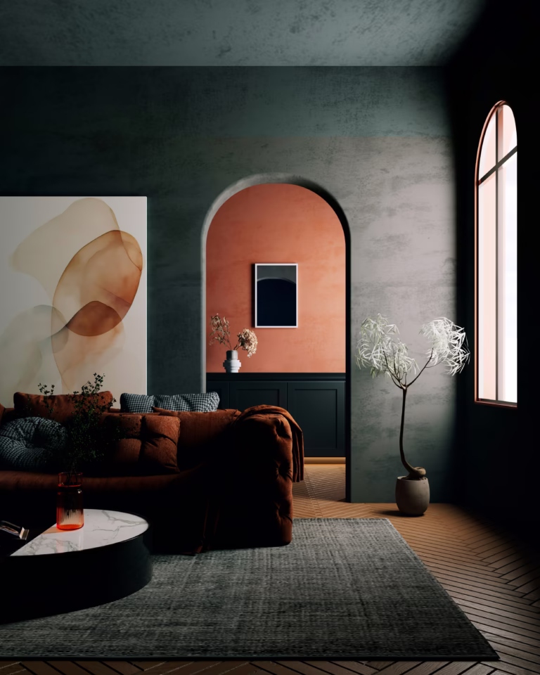
- Moody Blues and Green-Black Hues
Dark blues and greens continue to gain momentum, but the undertones are warmer and more complex than before.
Popular choices include:
- Inky navy
- Stormy slate blue
- Deep forest green
- Green-black charcoal tones
These colors are perfect for offices, dining rooms, powder baths, and bedrooms. They add drama while still feeling grounded and sophisticated.
Paired with warm metals like brass or bronze, these shades feel luxurious without being flashy.
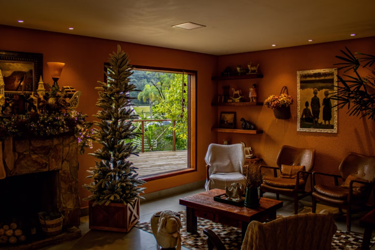
- Warm Browns Make a Comeback
Brown is officially back, and it’s nothing like the flat browns of the early 2000s.
Think:
- Espresso
- Chestnut
- Cognac
- Burnt umber
These tones are showing up in cabinetry, built-ins, accent walls, and furniture. When layered with lighter warm neutrals, brown adds depth and richness that feels classic and comforting.
Kitchens, in particular, are embracing brown cabinetry as an alternative to white or gray.
- Soft, Muted Reds and Clay Tones
Red is re-entering interiors in a much more refined way.
Instead of bold, primary reds, 2026 is all about:
- Terracotta
- Brick
- Dusty rose
- Warm clay and adobe tones
These colors bring warmth and subtle energy to a space. They work beautifully in dining rooms, bedrooms, entryways, and even kitchens when used thoughtfully.
They also pair exceptionally well with natural wood tones and textured finishes.
How to Use Moody Colors Without Making a Space Feel Dark
One of the biggest concerns homeowners have is that moody colors will make their home feel smaller or darker. When designed properly, the opposite is often true.
Here’s how we approach it at Eheart Interior Solutions:
Balance Is Everything
Moody colors shine when balanced with lighter elements. Think warm white ceilings, light wood floors, or soft neutral furnishings.
Layer Your Lighting
Good lighting is essential. Use a mix of:
- Recessed lighting
- Decorative fixtures
- Lamps and sconces
Warm light temperatures enhance these palettes and prevent them from feeling flat.
Embrace Texture
Texture adds life to deeper colors. Natural stone, wood grain, plaster finishes, and textiles all help moody hues feel dynamic rather than heavy.
Let Architecture Shine
Dark or warm colors highlight architectural details like trim, beams, built-ins, and niches. Instead of hiding these features, the right color makes them stand out.
Where These Colors Work Best
Kitchens
Warm neutrals, deep greens, and rich browns are redefining kitchen design. These palettes feel elevated, timeless, and far more forgiving than bright white.
Bathrooms
Moody bathrooms feel spa-like and intentional. Deep hues paired with stone, tile, and warm metals create a sense of luxury in even small spaces.
Bedrooms
Warm, saturated tones promote rest and relaxation. They make bedrooms feel cozy, grounded, and personal.
Home Offices
Dark blues, greens, and browns improve focus and reduce visual noise, making them ideal for work-from-home spaces.
Are Moody Colors a Trend or a Long-Term Shift?
While color trends always evolve, the movement toward warmth and depth feels more like a course correction than a fleeting trend.
These palettes connect to:
- Natural materials
- Timeless architectural styles
- Emotional comfort and livability
That makes them far more enduring than many past color fads.
When applied thoughtfully, these colors can feel just as relevant ten or twenty years from now.
Bringing the 2026 Palette Into Your Home
Choosing the right color is about more than picking a swatch you like. It’s about understanding how light, layout, finishes, and lifestyle all work together.
At Eheart Interior Solutions, we help homeowners throughout Northern Colorado create spaces that feel both beautiful and livable. Whether you’re planning a kitchen remodel, a bathroom update, or a whole-home transformation, we guide you through color choices that align with your home and how you actually live in it.
If you’re curious how moody colors and warm tones could work in your space, we’d love to help you explore the possibilities.
Ready to design a home that feels rich, warm, and truly yours?
Contact Eheart Interior Solutions to start your next remodeling or interior design project.
